

When you enter a particular room, do you notice any difference in emotion? Sometimes you may feel a surge in energy, tension, anger, calm, appetite, etc. Have you ever wondered why you feel this way in a particular environment and not the same in others? This response is the psychological effect of color in interior design.
Colors can lead to a range of emotions in different people. As the saying goes, beauty is in the eye of the beholder. A particular color may inspire one person but seem threatening to another. Some may find a color depressing, while another thinks it represents functionality and order. KRS Management Company says, “Choosing colors based on how those who live in the home is most important rather than other people’s feelings.”
Below are the psychological effects of different colors in interior design.
Black
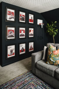
Black signifies elegance, versatility, functionality, simplicity, desire, beauty, power and protectiveness. It is the color of sophistication, control and modernism. However, some people may see it to symbolize terror, grimness and untidiness. Use this color carefully. An all-black room can be gloomy, overwhelming and depressing if not done well. For that reason, black is often used as an accent color.
Black often pairs with other colors, such as white, blue, red, green, etc. You can create a sophisticated environment through the skillful use of black. In official settings, proper use of black color can convey authority and formality.
White
The color white signifies peace, harmony, luxury, hygiene, cleanliness, elegance, tranquillity, fraternity and efficiency. It is the color of creativity, functionality, effectiveness, prosperity, control, trust and openness. However, white is best balanced with other colors to avoid excessive use of the color, which can seem cold and sterile.
White makes small rooms appear spacious. For that reason, it is a suitable color for people who have claustrophobia. People with hypertension and anxiety also tend to benefit from white because of its calming effect.
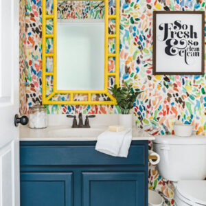
You can use white in any room, including the bathroom, dining, kitchen, bedroom or living room. If you want a luxurious design, pair white with gray, yellow, or gold. To elicit a calm and serene space, pair it with blue or green.
Blue
Blue signifies calm, softness, trust, faith, loyalty, courage, power, wisdom, control, tranquillity and bliss. It is the color of prosperity, elegance, luxury, intelligence, knowledge, seriousness, health, healing and integrity. Blue has been shown to slow down blood pressure, heart rate and metabolism. It also relaxes the mind.
Blue is one of the colors with little or no negative psychological impact. However, excessive use of blue may be depressing, and complementary colors balance it out. You can use blue in the bathroom, bedroom, dining or living room.
Orange
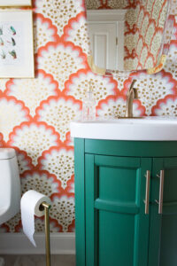
Orange signifies warmth, happiness, relaxation, passion, joy, pleasure, sexuality, desire, love, attachment and attraction. It is the color of wealth, prestige, wisdom, prosperity, energy, healing, adventure, creativity and determination. However, it may cause distrust, deceit, dominance, betrayal and aggression in some people.
Because it stimulates appetite, orange is a suitable color for kitchens, dining, restaurants and other rooms that encourage social interaction. If you use it in the bedroom, pairing it with complementary colors would help reduce the effect to create a more calming environment.
Red
Green
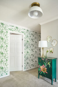
Green signifies nature, peace, protection, security, safety, harmony, growth, fertility, comfort and calmness. It is the color of joy, healing and freshness. However, some people see green as a sign of conflict, ambition, cowardice, jealousy, greed and sickness. Because of its relaxing effect, it is appropriate for those with hypertension. You can use green in any room.
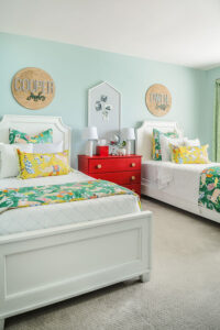
Pink
Pink signifies love, compassion, romance, nurturing and sweetness. Most people prefer using pink in the bedroom of teenage girls. But when used well, it adds sophistication, cleanliness and glamor to any space. You can also use pink in the bathroom, living room and other places you want to elicit bliss and joy.
The bottom line
Choosing appropriate colors for different rooms is easier if you are familiar with color psychology. But when designing your home, using the colors you love is most important. Are you looking for an interior designer in Charlotte, NC, who can help you incorporate color without the overwhelm? You’re invited to schedule a complimentary discovery call! CoCreative Interiors works with you to design a home that reflects who you are and what you love. We can’t wait to hear from you!


0 Comments