Welcome back to part two of our historic home redesign. If you missed the first post that covered project goals and before pictures, you can read it here. Next, we move into the process of making the design changes in Andrea and Stephen’s home. As was mentioned before, creating a home with plenty of entertainment space was super important to this lovely family. That meant creating defined space within existing rooms.
Dining Area
Though the clients renovated the kitchen, the home didn’t have a defined dining area. Fortunately, what seemed to be an odd dead spot between the kitchen and the family room turned out to be ideal for adding a large dining table.
Local artisan Daniel Taylor of Jesus Was A Carpenter handcrafted a table for seven, perfect for dinners, board games, and gatherings to create a dining area. Rotating the kitchen island and attaching the table to its side maximized the space. Painting the legs of the table to match the island color created a custom piece that looked as though it had always been there.
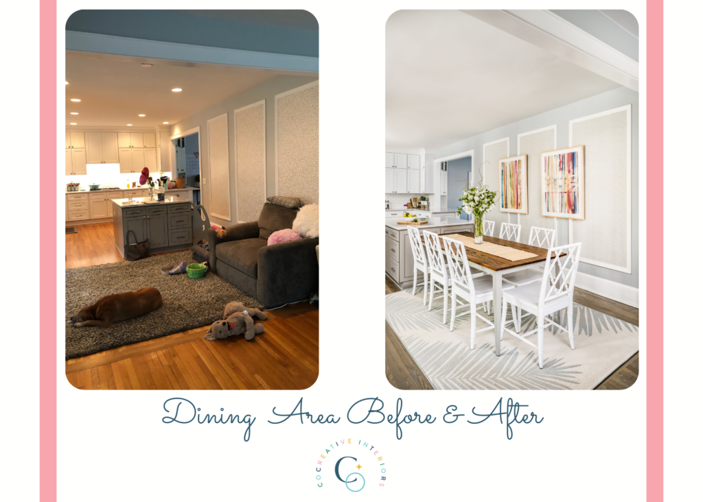
Adding an area rug under the dining room table defined the space. The rug’s palm frond design gives a nod to the subtle coastal theme. While area rugs are a great addition to a dining room, using an outdoor rug is sometimes the best choice. Made with materials that can withstand the wear and tear of an eating area, many can even be hosed off if things get really messy.
Andrea and Steven had added molding and wallpaper to the main wall in the kitchen before our project. As the primary focal point for this room, adding visual interest to this wall was a priority.
We create a layered effect using paint, wallpaper, and artwork. The walls were painted the pale blue-gray color called Misty by Sherwin-Williams, SW-6232. We added a subtle blue and white floralesque wallpaper inside the molding the owners had installed. Finally, we layered two oversized watercolors on top of the framed panels to balance the space and provide a focal point over the dining table.
Defined space in the Family Room
The family room needed to change from narrow and awkward to multi-functional and fabulous. With a wish list that included lounging and curling up with a good book to entertaining, the space had to do double duty.
Color Palette
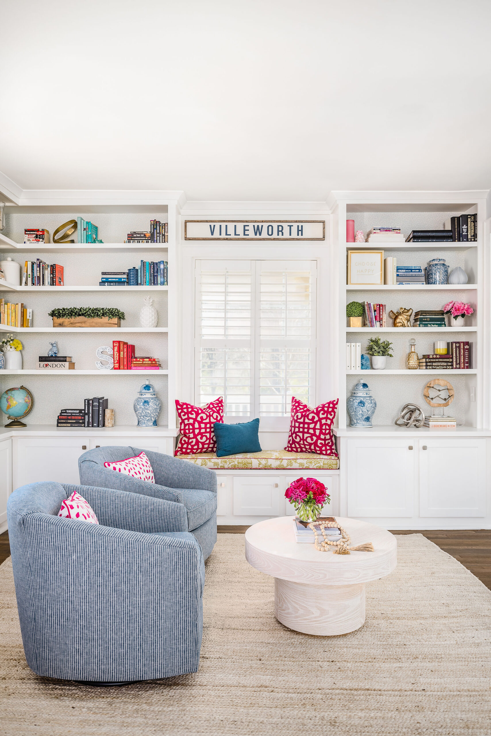
The first step in reimagining the room was to create defined spaces. A long, narrow room can feel like a bowling alley without intentional definition. Since the clients love to read, we divided the room into two areas – a library cocktail lounge on one end with a tv/entertainment area at the other.
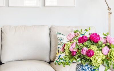
Our main aesthetic goal was to make the family room feel bigger and brighter. The first step to creating a bright and airy space was developing a light, neutral palette with pops of color throughout.
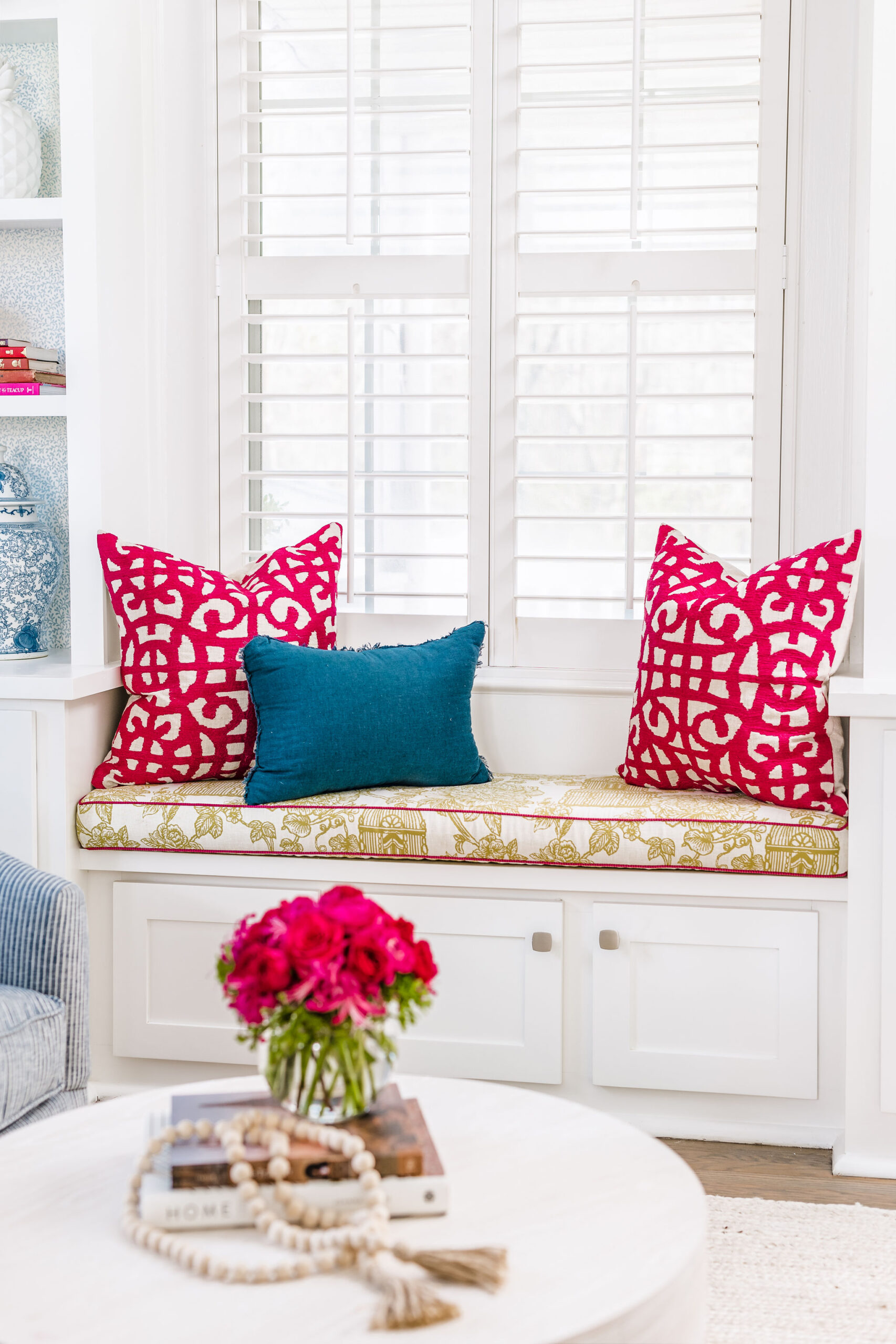
Helping clients step outside of their color-choice comfort zone is a highlight of our work. Pops of cheerful color give a nod to Andrea and Stephen’s vibrant personalities. With a love of pink, adding touches in measured amounts brings an air of sophistication. Deep pink also pairs well with blues and greens, Andrea’s favorite colors.
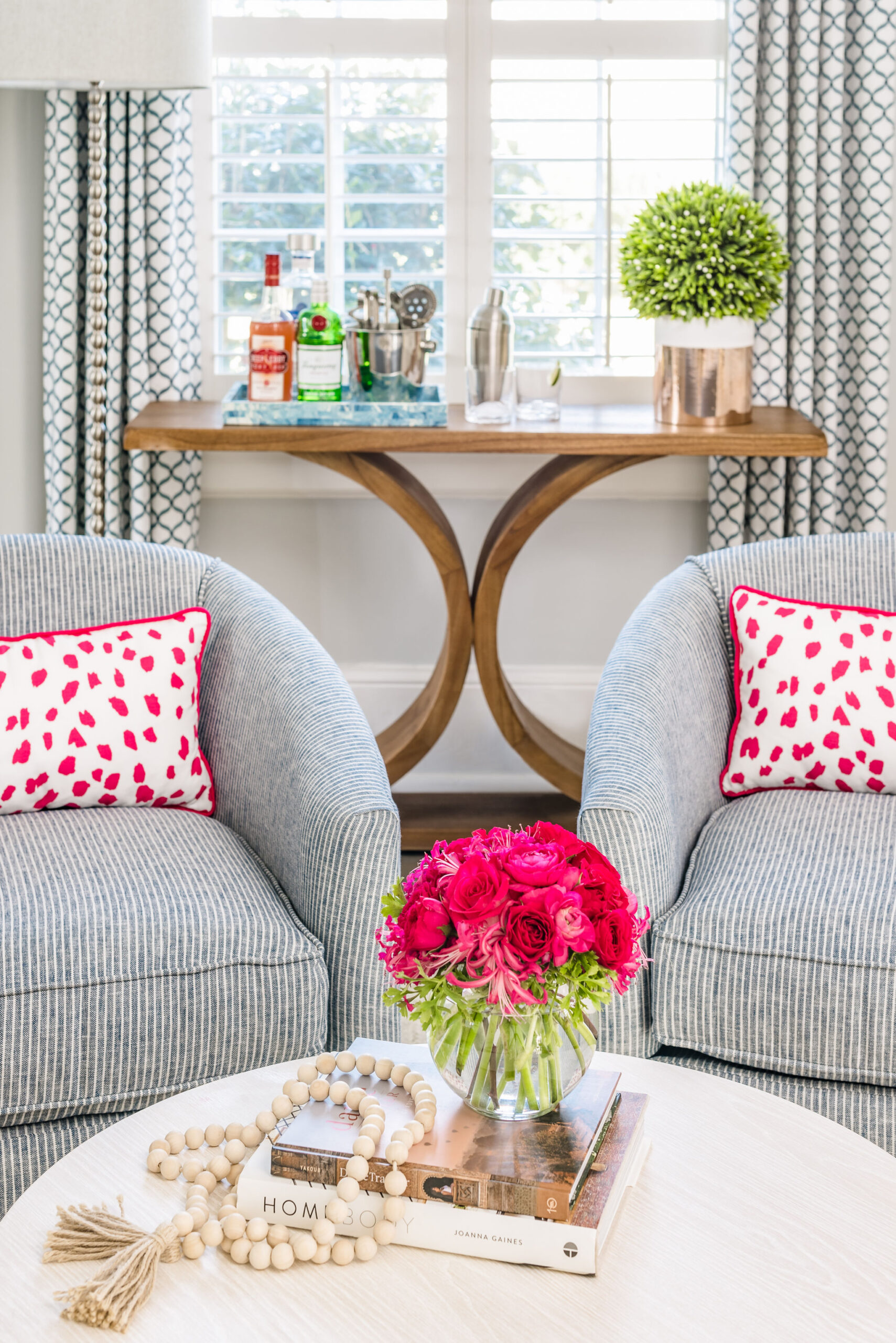
Photos: Tiffany Ringwald Photography
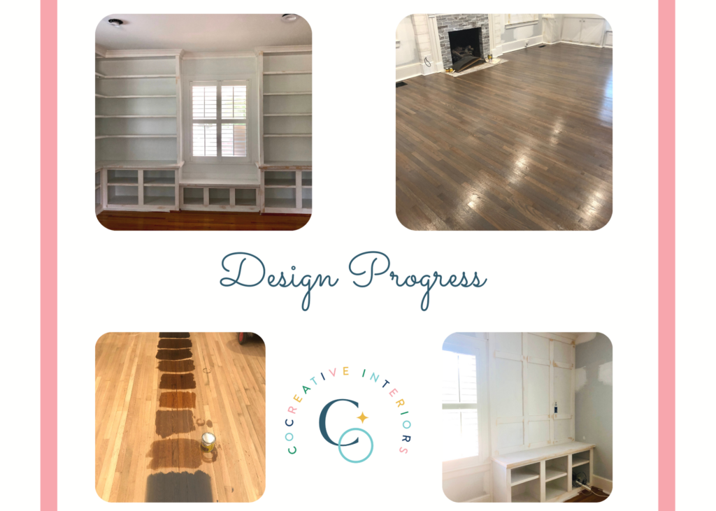
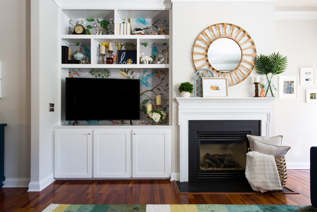
We also added color with wallpaper accents throughout the family room. We lined the new built-in bookcases with the same pattern used in the dining room, tying the two spaces together. Using wallpaper on the backs of bookcases is a fantastic way to add visual interest without committing to a wall of a pattern.
Navy blue textured grasscloth replaced the faux shiplap wallpaper covering the fireplace bump-out. The fireplace became a beautiful focal point of the room with a freshly whitewashed brick surround.
Storage
Storage is a priority for most CoCreative clients. They want to keep things easily accessible but don’t want the clutter. We are always looking for ways to solve storage problems for our clients. In this family room, we needed to create storage for books, knick-knacks, and tchotchkes. Stephen and Andrea also needed storage for their daughter’s toys and craft supplies so they were easily accessible but out of sight when not in use.
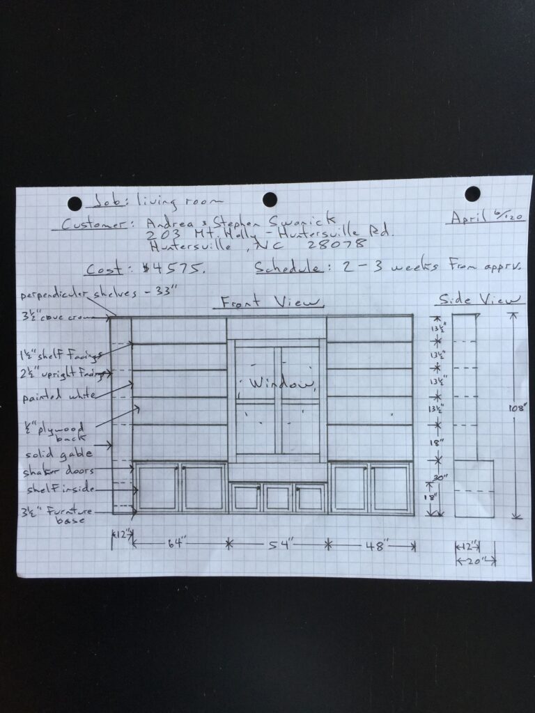
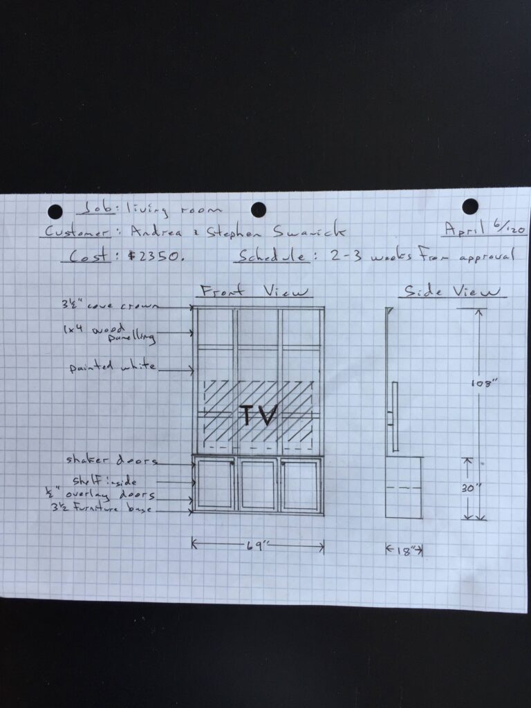
We replaced off-the-shelf bookcases (pun intended) with custom built-ins designed with open shelving atop enclosed cabinetry. This design choice gave the clients display space and hidden storage.
Our built-in plans also included a bench seat perfect for reading and, as another seating option, ideal for entertaining. The bench also provided storage. While installing built-ins is an investment, they add value to your home. Tip – add electrical access to your built-ins to use for task lighting and easy holiday decorating!
TV Area
Before redesigning the family room, the TV was placed above the fireplace. Because the room was so narrow, sitting on the sofa and watching TV was so uncomfortable that the clients created a second TV area in the dining room.
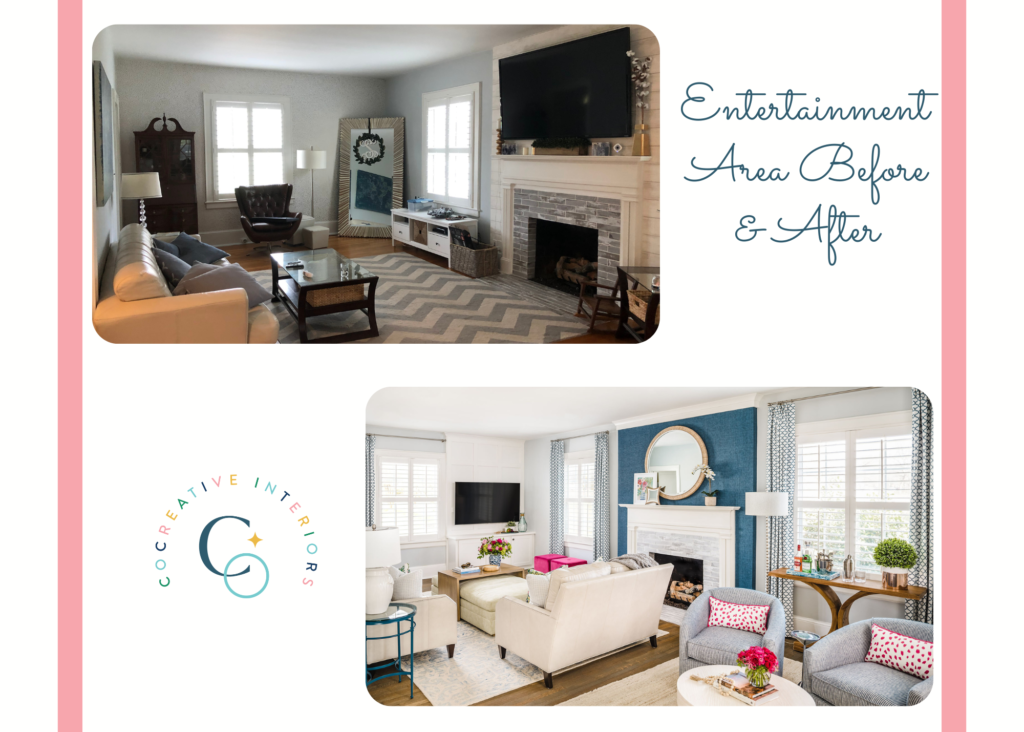
Moving the TV to the side wall positioned it for better viewing. This change also allowed us to add another small storage area with a built-in entertainment center. The cabinet hides all the tech components with the TV mounted to the wall on a positionable arm.
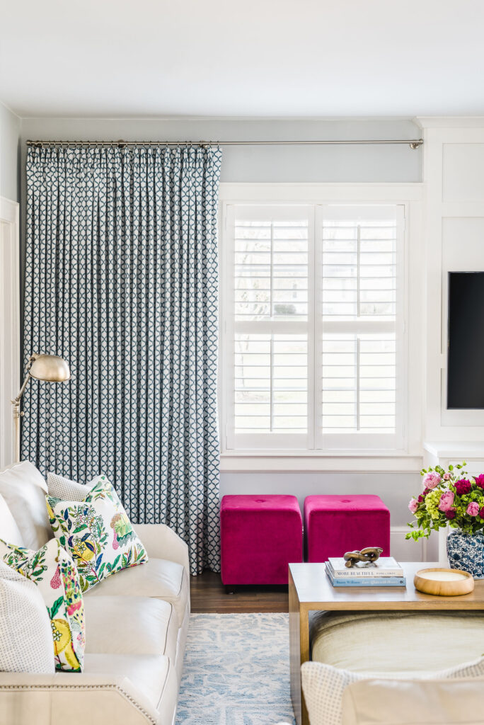
Because the entertainment center was installed on one side of the wall, we balanced the visual weight of the built-in unit with a wall of drapery. Lining the lightweight embroidered fabric gives the curtains fullness and weight, helping the drapes hang properly.
Working on this home was a joy. We love bringing our client’s personalities to life through design, and this project was no exception! In our next post, we’ll share the remaining design details and THE BIG REVEAL. Grab our free project planner if you’re ready to jumpstart your own design project! And if you live in the Charlotte area and want to chat about your project, book a complimentary discovery call!

0 Comments