We are so excited to share the final details of this family home project! We are giving you the last spaces and gorgeous images of the finished home including the surprise powder room. If you missed part one, you can catch up here:
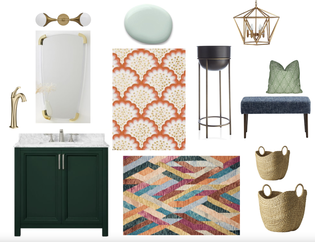
Before we dive into the last three spaces, check out the design board we presented to our clients.
Kitchen
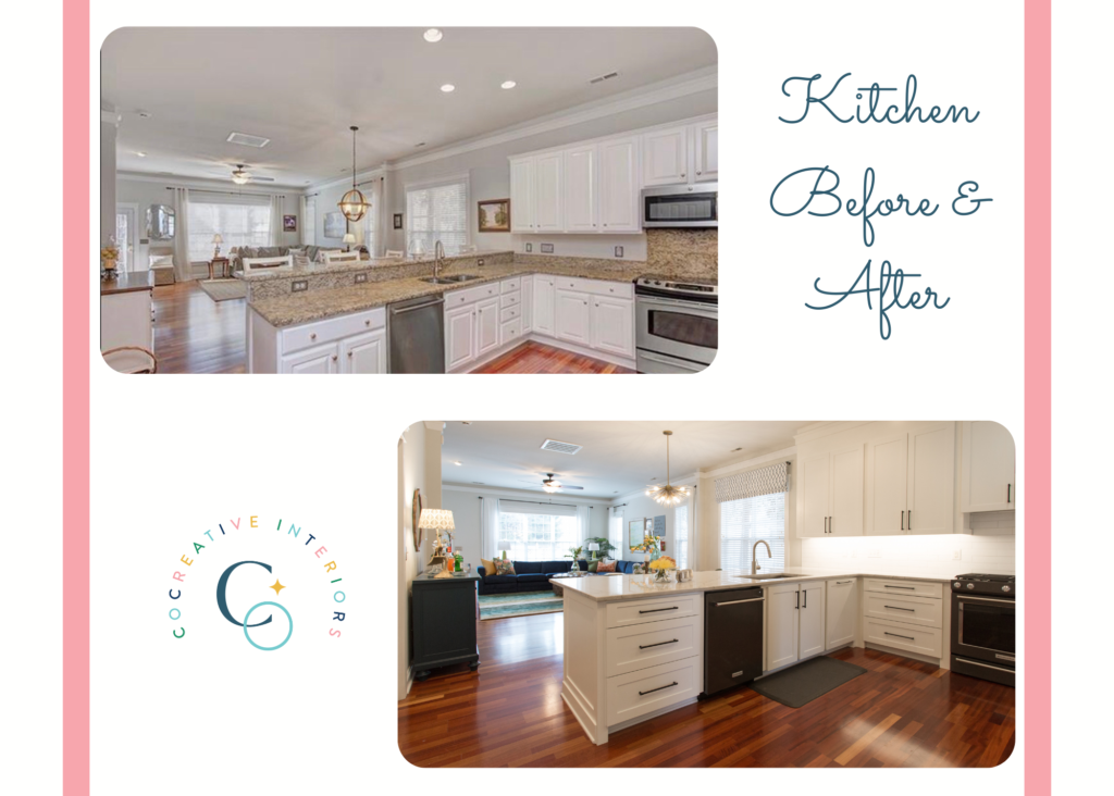
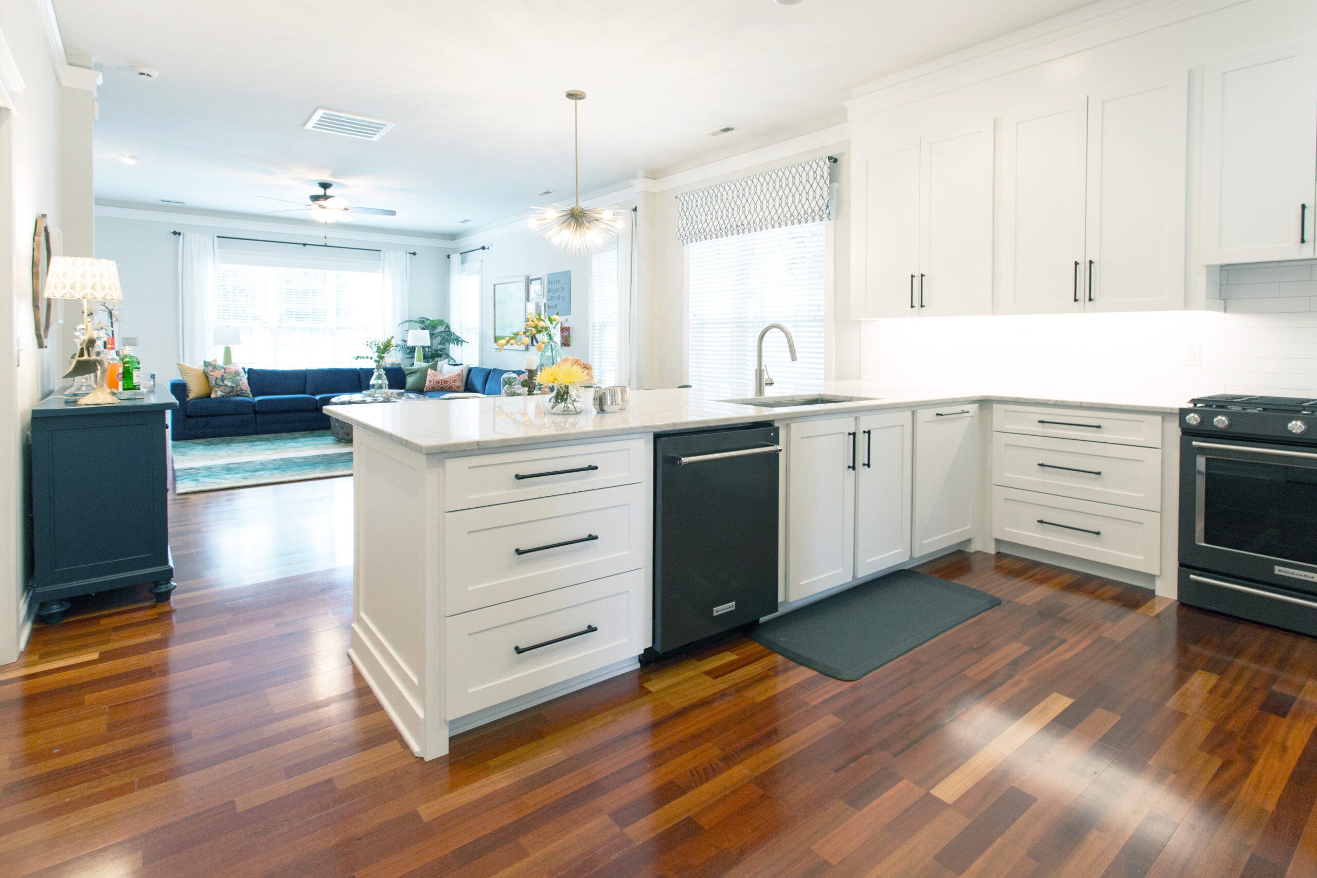
The kitchen had an open layout and needed a few simple but impactful updates to make the room feel fresh and more aligned with the family’s aesthetic.
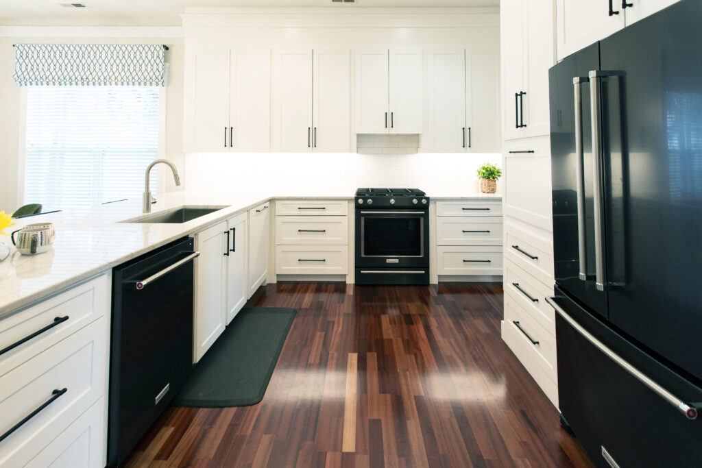
New countertops, updated cabinets and a modern backsplash made for a big change. The original double bar created a visual stopping point between the dining room and kitchen. The tallest part of the counter was a narrow overhang that did not serve much purpose besides collecting clutter.
An elevated counter can feel like a mini wall when someone sits at the dining table and tries to chat with people in the kitchen. To create better flow between the kitchen and dining room, we removed the tall section of the counter. This change immediately opened up the space and now allows anyone in the kitchen to easily interact with people in the dining and living room. Bonus, there’s more counter space for spreading out food for entertaining!
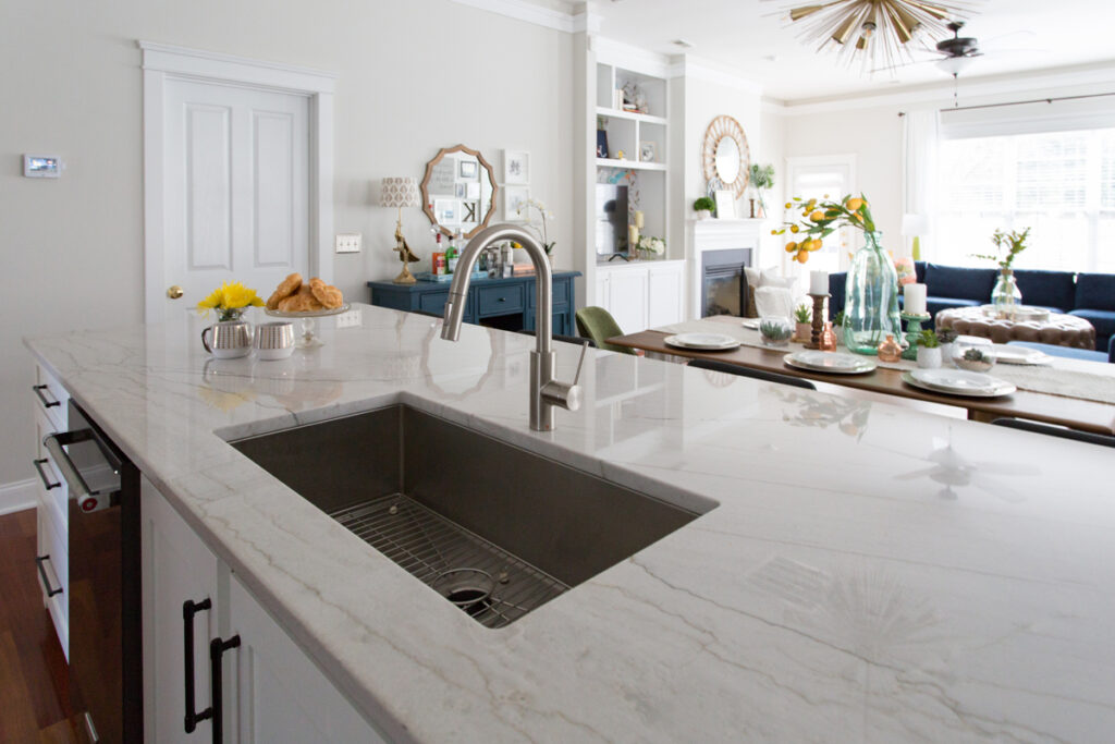
After removing the double bar, we swapped out dated countertops for quartz. We also added a classic white subway tile backsplash. In our experience, many people think a kitchen remodel must be all or nothing. While a total remodel can be fun, a total overhaul requires a significant investment. You can get a similar transformation with new countertops and a backsplash at a much lower price point.
Take a look at these before and after photos!
Foyer
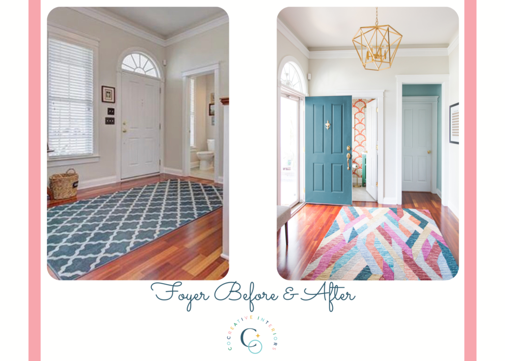
Entry foyers are often forgotten spaces in the home. People don’t spend much time in the foyer, so it’s not a space that is high on the design priority list. As the first place people see in your home, make it a showstopper!
We started with a brightly colored rug that tied together all the hues found throughout the home. We also added a caged chandelier to give the space drama and draw the eye upward. A small padded bench creates a space for sitting to remove shoes. Even in small areas like a foyer, we recommend considering how people will use the room when selecting pieces. If you notice your guests leaning against the wall or holding the door frame to get their shoes on and off, a bench is a gracious touch that will make people more comfortable.
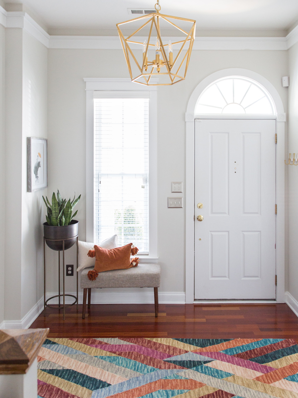
A foyer is also an ideal place to add artwork and pieces that reflect the interests and personality of the family. These clients love to visit national parks, so we framed a piece of art that lists all the US National Parks. As the family visits, they can scratch off each park name to reveal an image of the park beneath. The piece is a fun conversation starter!
Finally, we painted the small nook off the foyer the same color as the ceiling in the powder room, tying all the spaces around the foyer together. Check out the beautiful before and after images of this welcoming space!
Powder Room
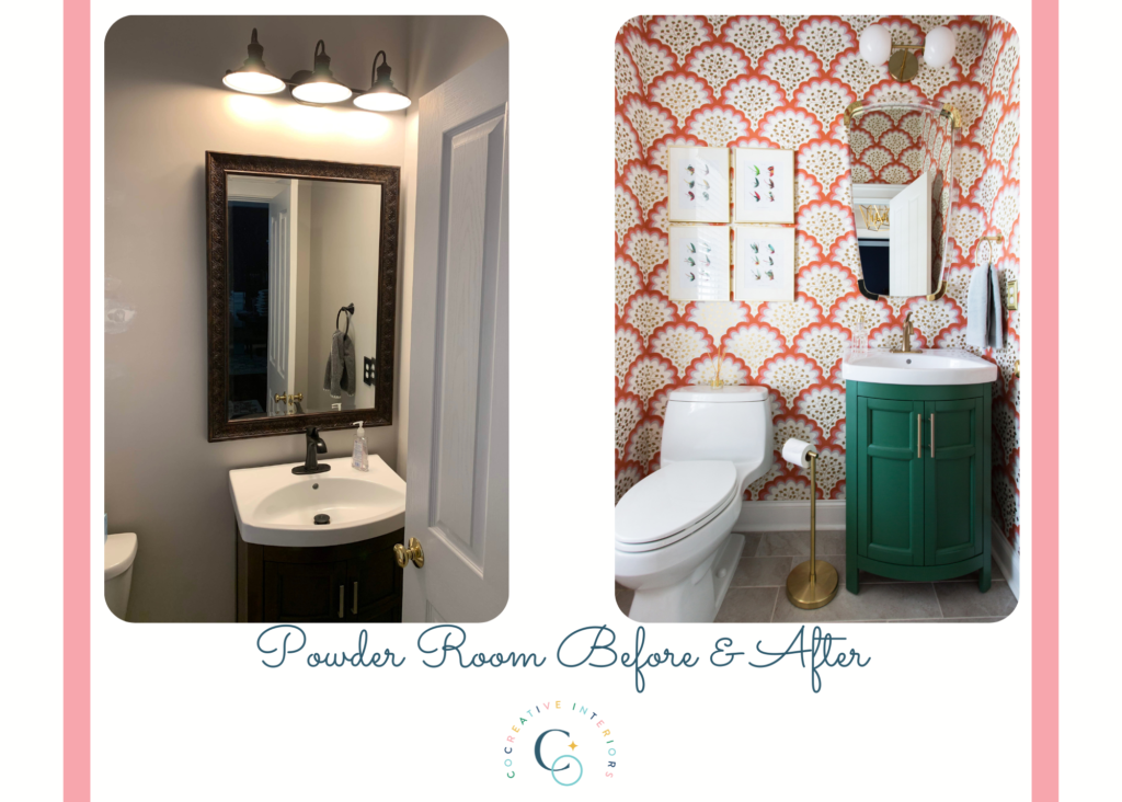
The powder room was not on the original design plan, but the husband wanted to surprise his wife by adding this space for an unexpected reveal. We worked with him to create the design, which was presented to them at the design meeting. She was overjoyed by his thoughtfulness! This fun surprise became one of our favorite parts of the project.
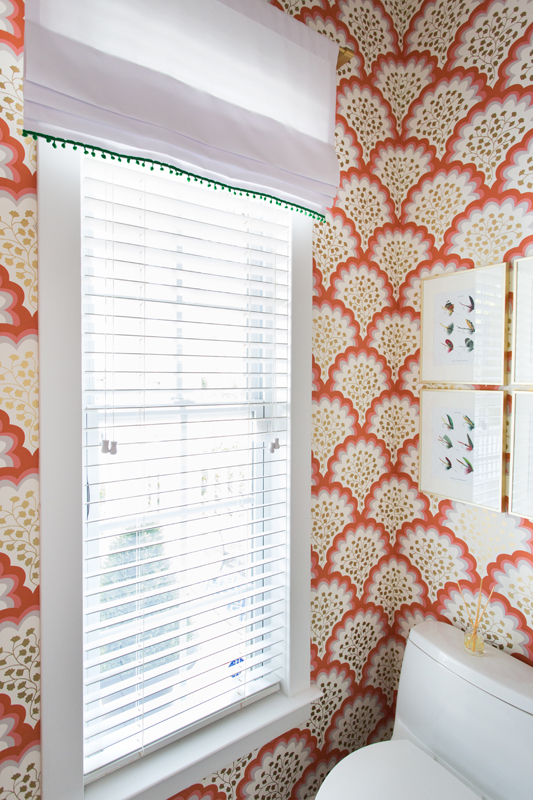
The most striking part of the powder room is the bold wallpaper. Some people would shy away from a large pattern with bold color in a small space because they worry it will overpower the room and make it feel small. In reality, a large print can make a room feel bigger. The wallpaper also has hints of gray, which tie in with the existing gray tile floor.
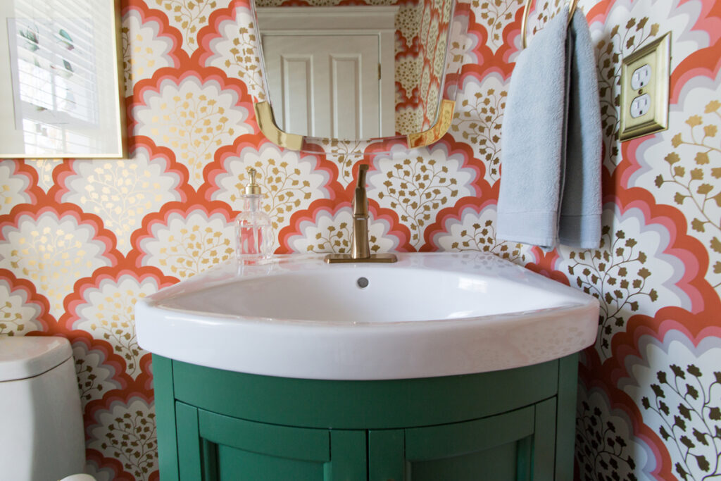
We kept the original vanity but painted it a deep emerald green. We also complemented the gold in the wallpaper with new gold hardware on the vanity doors, faucet, and fixtures. Adding gold pops in the hardware accentuates the hints of gold on the walls and makes the room feel cohesive and intentional.
The original mirror was much too large for the space. In design, scale is very important to the finished look. A large mirror is thought to make a room look bigger, but in this case, it made the vanity look small and out of place. We found a mirror that narrows at the bottom and was the perfect size so as to not overpower the vanity. We also updated the vanity lighting to something more size appropriate for the space.
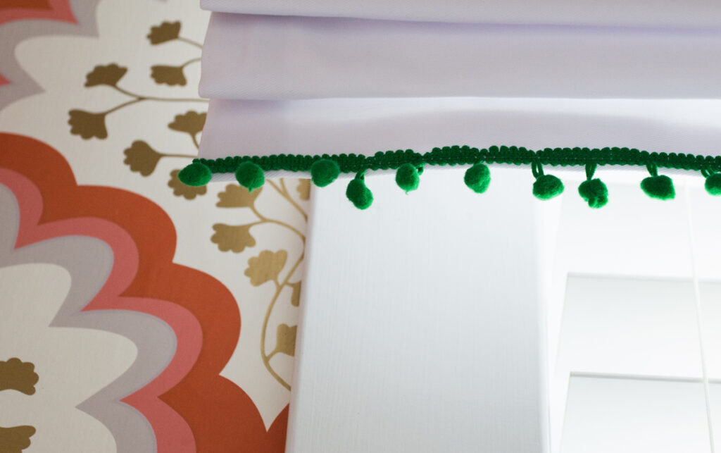
The clients wanted to keep the existing blinds for consistency throughout the home. We added a crisp white faux roman shade with deep green pom-pom trim to tie into the vanity color. Lastly, to infuse a little personality, we added a set of fly fishing lure watercolors as a nod to their son’s love of fly fishing.
This room became a showpiece of the home! Check out the before and after images of this lovely little powder room.
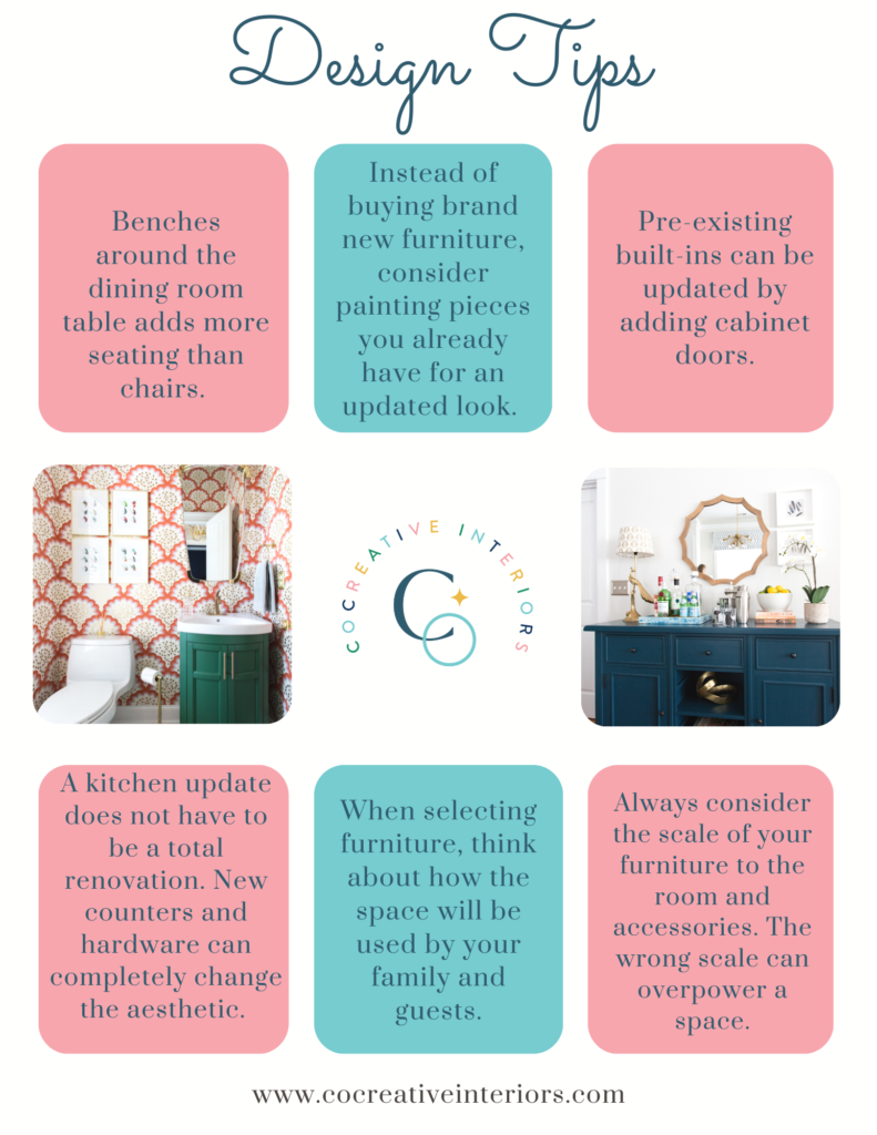
Design Tips
Major takeaways from this design:
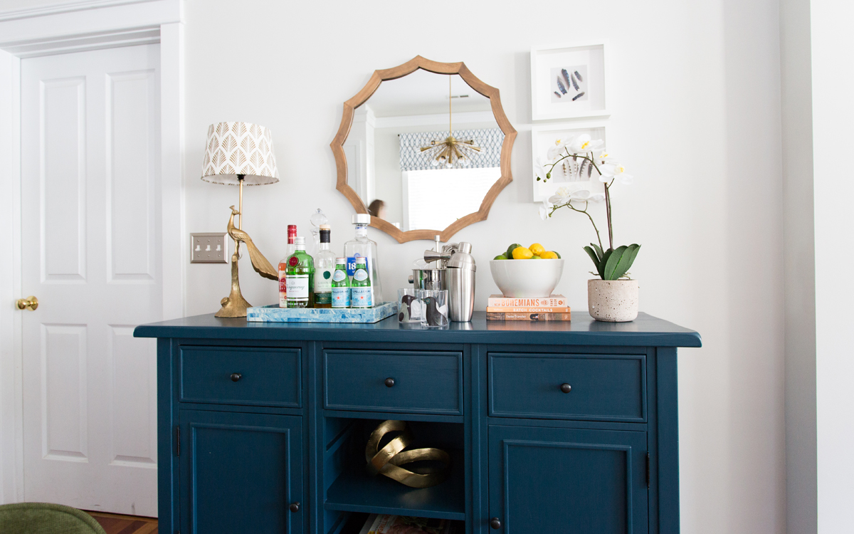
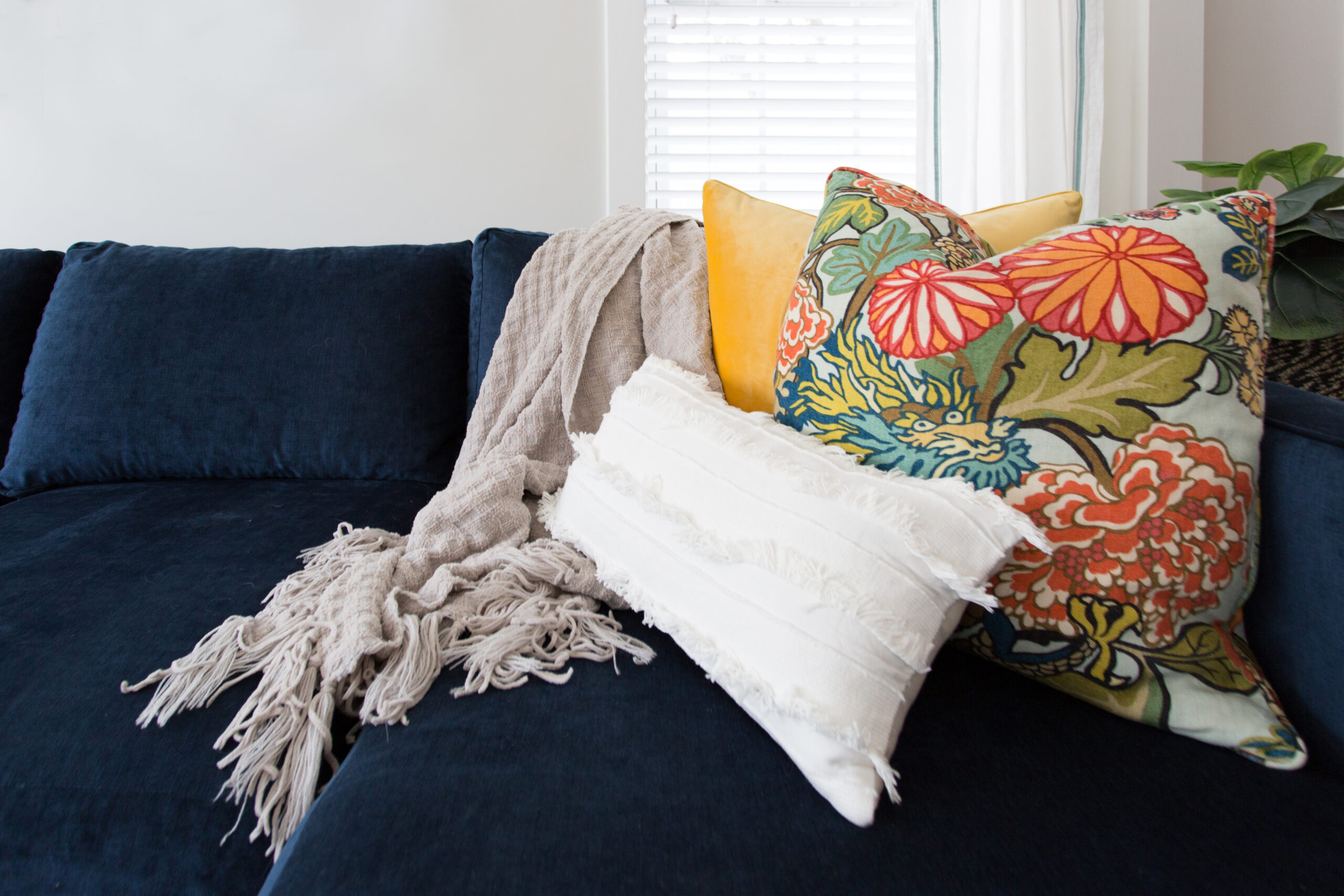
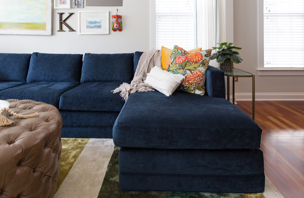
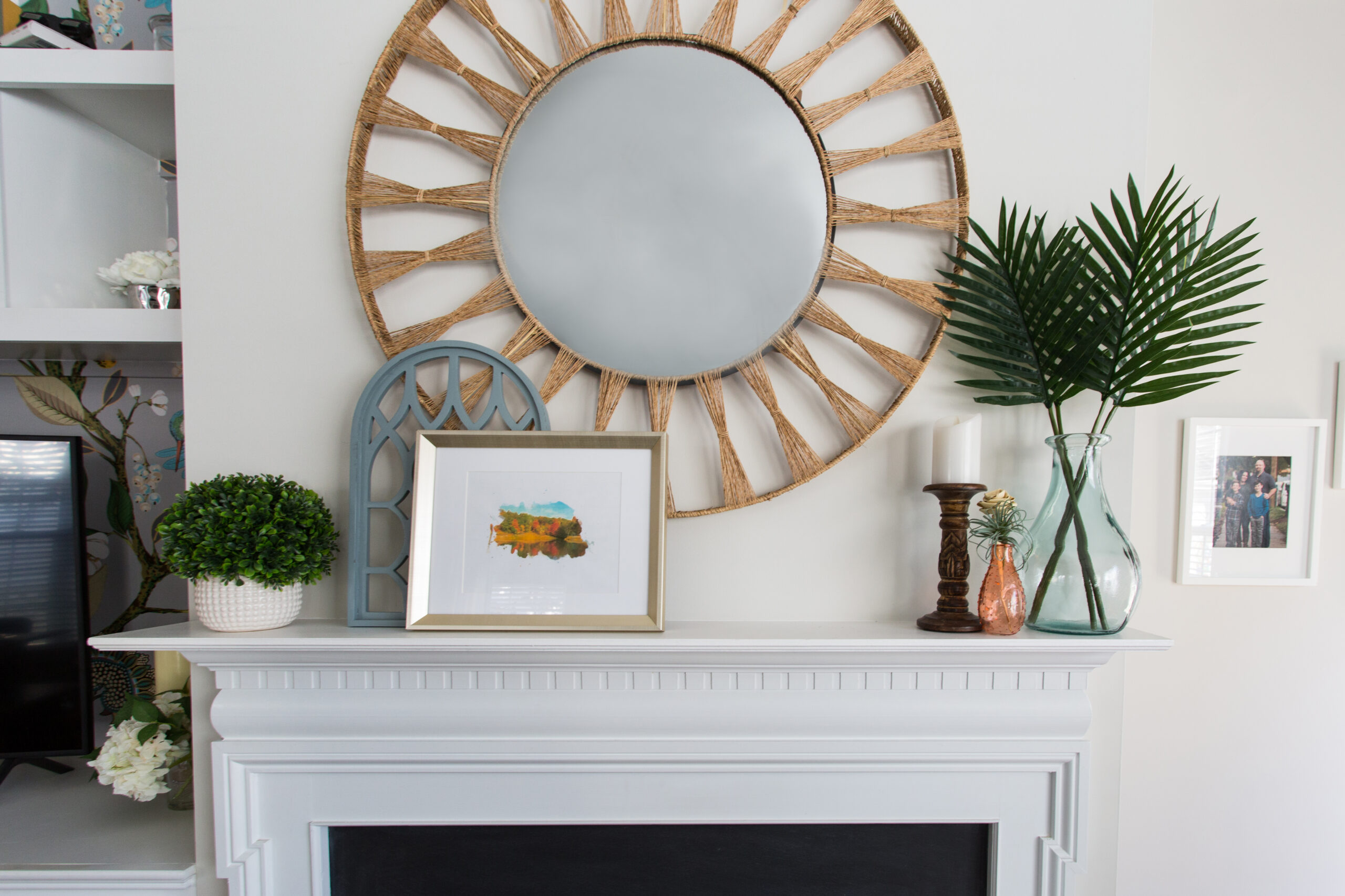
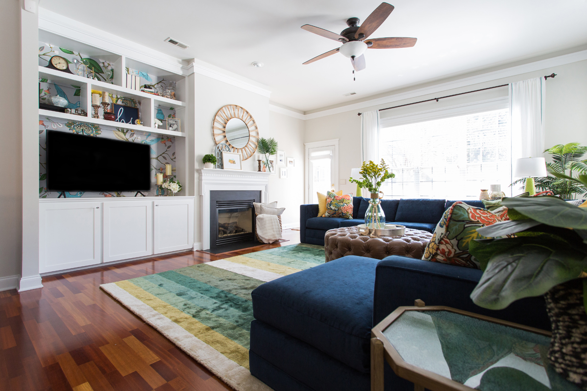
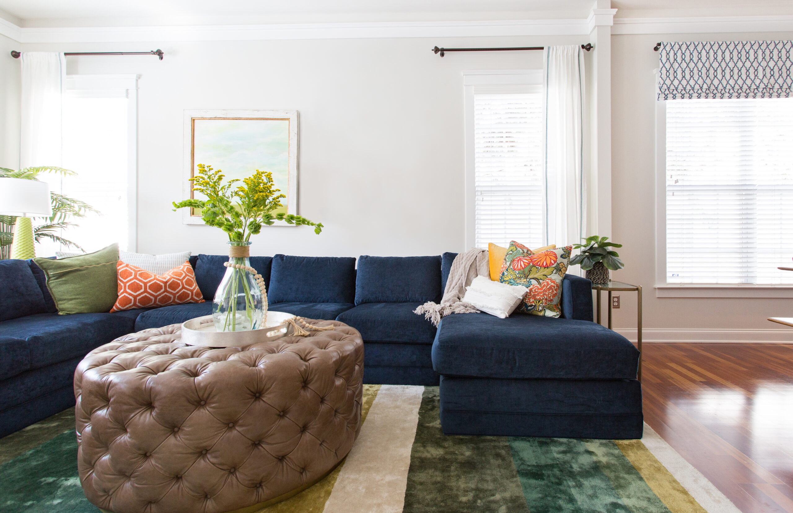
Here are the final results:
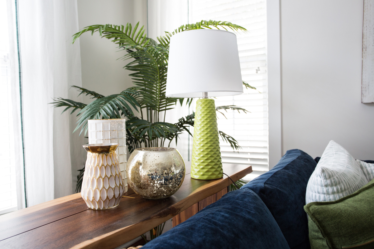
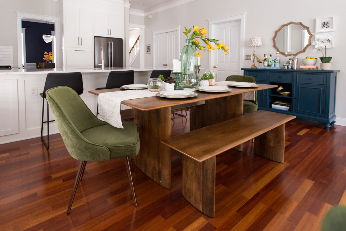

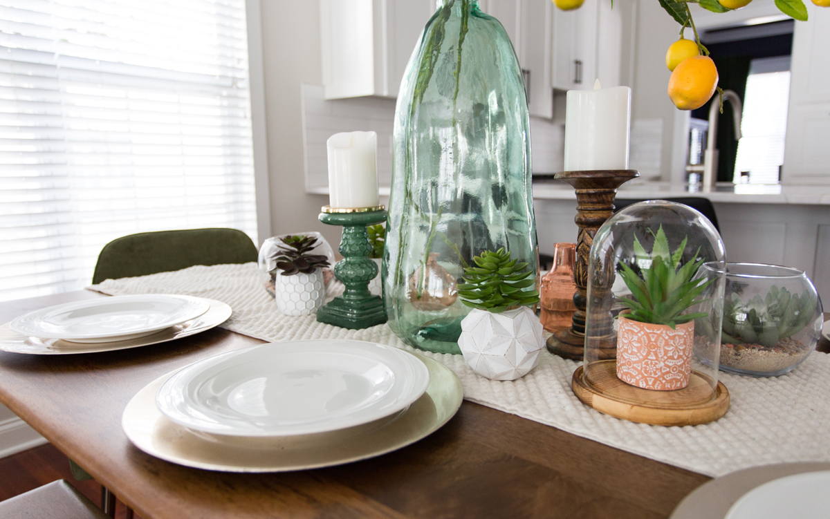
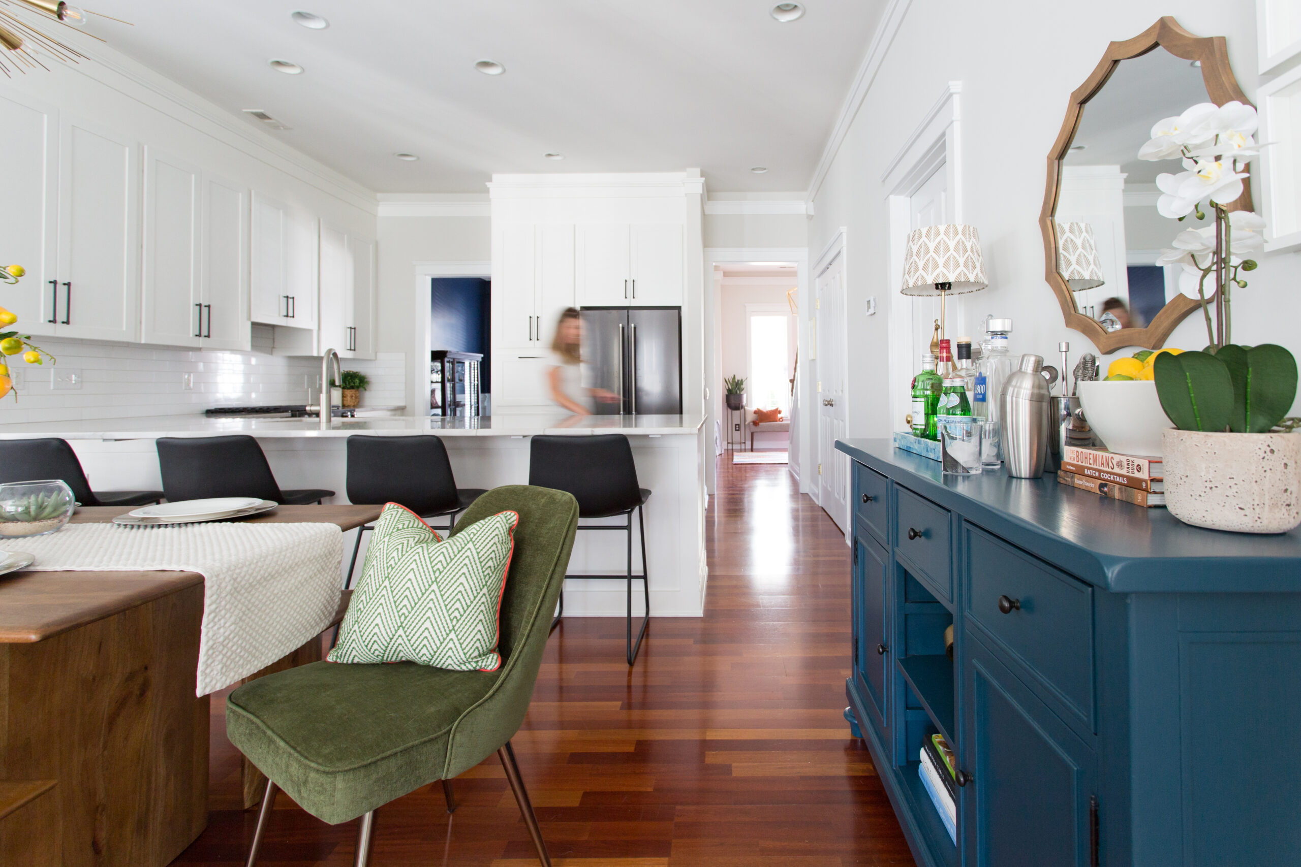
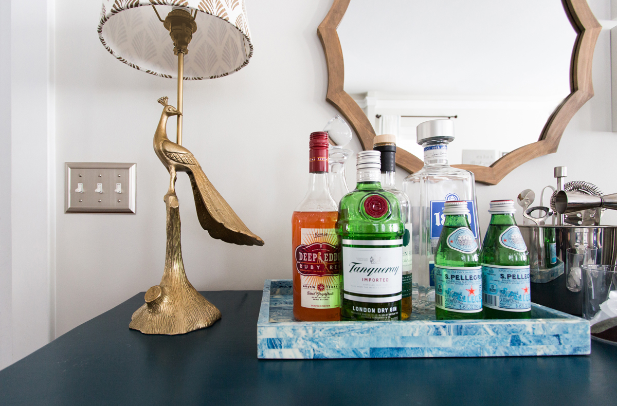
Photos: Tori Hartwell Photography
This multi-room project was such a fun challenge! We love bringing our client’s vision to life.
If you’d like to chat about your Charlotte, NC, interior design project, you’re invited to book a complimentary Discovery Call! You can also download our free project planner and budget worksheet to jumpstart the design of your dream home.
Vendors Used In Our Design
Powder Room
Valences: JaimeInteriors – Etsy
Paper Holder: Modern Furniture Store & Contemporary Home Decor Online | CB2
Sconce, Towel Ring, Mirror, Wallpaper, Curtain Rod, Soap Dispenser: West Elm: Modern Furniture, Home Decor, Lighting & More
Faucet: Wayfair.com – Online Home Store for Furniture, Decor, Outdoors & More
Vanity Paint: Heirloom Traditions ALL-IN-ONE Paint (allinonepaint.com)
Toilet Paper Holder: Amazon.com. Spend less. Smile more.
Foyer
Plant Stand: Amazon.com. Spend less. Smile more.
Chandelier: Lighting: Modern Chandeliers, Lamps & Light Fixtures | Crate & Barrel (crateandbarrel.com)
Rug: Loloi Rugs
Bench: Wayfair.com – Online Home Store for Furniture, Decor, Outdoors & More
Art: Home Decor Store And More | HomeGoodsOrange Pillow: West Elm: Modern Furniture, Home Decor, Lighting & More

0 Comments