Have you ever been scrolling Pinterest or flipping through a home decor catalog inspired by all the beautiful rooms? You pin, fold down pages, and set out to recreate the look in your own home. Often, even if you purchase the EXACT pieces you see online, and in catalogs when you put it all together in your home, it is not the same. What is that all about? In many rooms, it is just a matter of furniture spacing. There are specific measurement and furniture spacing rules that can add to the ambiance of your space when followed.
Furniture Spacing and Walls
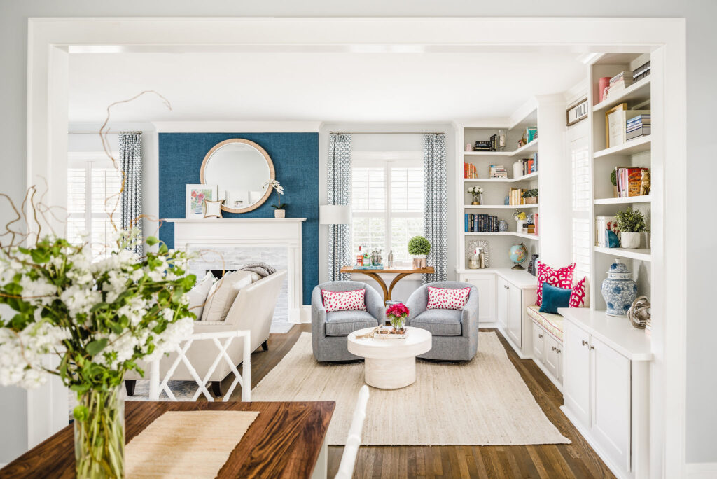
The biggest tip for stylish furniture spacing is: don’t push the furniture to the walls. Take a look at any interior design magazine or design show, and you will notice that the furniture is not pressed against the room’s walls. If you allow a few inches between the walls and the furniture, it makes the room feel larger. By pulling your furniture toward the center, you make the space feel cozier instead of ample dead space in the center.
Arrange Furniture Around A Focal Point
When we design a room, we start with a clear understanding of how the space will be used. Is it a TV room meant for watching movies as a family? Is it a space to host and have conversations? Furniture spacing will be determined by how you use your room, so select the function and choose a focal point. Your focal point can be a part of the room structure, such as a fireplace or picture window. You can also create the focal point by adding a TV area.
For example, a family room may arrange the furniture toward the television or around a game space. You might arrange furniture around the fireplace in a formal living room to facilitate cozy conversations with guests.
Furniture Spacing for Traffic Flow
Think about how people move through the space when planning your furniture spacing. Make sure that the entryway to the room is clear. It is a very awkward and unwelcoming feeling to walk into a room and straight into the back of a couch or an area crowded with stuff. Once you have all your furniture arranged, walk around and access each piece. Do you have to zig-zag? Or are there direct routes you can take? If you feel crowded, imagine how a guest might feel.
In interior design, there is something called the 3-foot rule. You need about three feet of clearance around the room to avoid bumping into things and feeling overcrowded. While you don’t have to be exact, this is an excellent measurement to try and hit when thinking of the traffic flow related to furniture spacing.
Use Rugs for Definition
Area rugs are a great way to define the space. It creates a little grouping within the larger room, creating a cozy and intentional space. When choosing a rug, make sure it is large enough for all the furniture in the seating arrangement can be entirely on the rug. If the furniture is placed half on and off, it can create a wobble. Also, when placing your rugs, avoid edges being in high traffic areas as that can make a tripping hazard.
Coffee Table as an Anchor
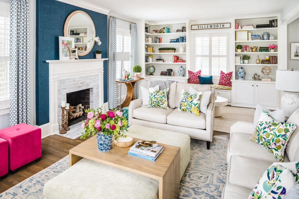
Unless you have little ones using a space as a play area, a big coffee table can be a great anchor and focal point for a room. It is a nice aesthetic piece to tie a room together; it is super functional. Whether it’s a place for a gorgeous floral arrangement, a flat surface for board games, or a place where everyone can set their drinks. When choosing a coffee table, bigger is often better. Just make sure that there is enough space between seating and the edge of the table for people to walk around. 18 inches is an excellent minimum clearance. Another thing to remember is that a coffee table should be the same height as the sofa and chairs or slightly shorter.
Arms Reach Tables
When planning your furniture spacing, be sure that every seat has a table within arm’s reach. Whether it is the coffee table or side tables, keeping them within arms reach ensures that no one has to reach too far for their drinks. It is a small detail, but it adds to a room’s functionality and welcoming feeling.
Consider Balance When Arranging Furniture
When placing furniture in a room, make sure the entire space feels balanced. A room where all the furniture is placed on one side of the room or towards one corner feels lopsided and uncomfortable. When spacing your furniture, everything does not need to be symmetrical, but you can balance one piece with another. For example, your sofa should be balanced with something of equal visual weight like another sofa or entertainment center.
Space Furniture for Conversation
My favorite tip is to arrange with conversation in mind. Even rooms with a TV as a focal point are often used to gather the people you love. When spacing your furniture, think about sitting with people and chatting. Do people need to contort their bodies to look at one another? Or is the space comfortable for conversation? Since our homes are meant to be comfortable and welcoming, a space that facilitates connection is a welcoming one.
Furniture Spacing Rule of Thumb Measurements
When planning your furniture spacing, there are some simple rule of thumb spacing measurements to keep in mind. Here is a handy list!
- 18″-Distance between the coach/chair to the coffee table
- 10″ -20″-Distance between the edge of an area rug and the wall (depending on the size of your room, this may need to be adjusted)
- 36″- Distance between the wall and a piece of furniture
- 42″-Distance between two living room chairs side by side. This distance allows a table to be placed between them.
- 24″-Distance between two chairs in a smaller living room.
- 0-4″-Space between a seat and ottoman
- 3’-space between furniture to allow for a smooth flow of traffic
- 3’-Minimum space between dining room tables and the wall or other piece of furniture
- 2’-Amount of space for each seat at a dining room table
- 2’-Clearance around the bed
- 4′ to 5′- Distance between a bed and desk or dressing table
- 2’-3’-Distance between twin beds
- 3’-Distance between bed and closet doors
Don’t Forget the Lighting
Often what makes rooms feel cozy is the lighting. By incorporating various types of lighting, you can create ambiance and functionality. When choosing your lighting, you can keep in mind some simple measurements to blend seamlessly into the room.
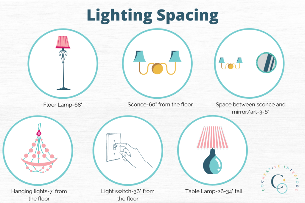
- 68″—Ideal floor lamp height
- 60″—Minimum height for a wall sconce
- 3″ to 6″—Ideal space between a wall sconce and the edge of a mirror, picture frame, or piece of art
- 7—Minimum distance between the bottom of a hanging light and the floor if people will be walking underneath
- 36″—Distance a light switch should be above the floor
- 26″ -34″—Average size of most table lamps
Artwork
A room really comes together when you add in the wall hangings. Whether artwork or family photos, a well-placed frame can really pull all the decor details together. Use our measurement guide for the perfect placement instead of eyeballing where you should hang your art.
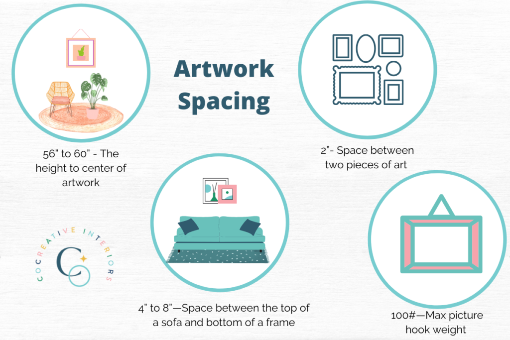
- 56″ to 60″—The height of the artwork’s center. This is usually eye level. It is sometimes tempting to hang a piece higher on the wall, but eye level is most pleasing to the eye.
- 2″— Space between two pieces of art
- 4″ to 8″—Space between the top of a sofa and bottom of a frame
- 100#—The max weight that a larger picture hook can handle when hanging a frame.
Window Treatments
I adore a good window treatment! It can be transformative in a space, and based on the fabric, pattern, and style, you can really change the room’s ambiance without doing much else. When buying window coverings, consider the following measurements:
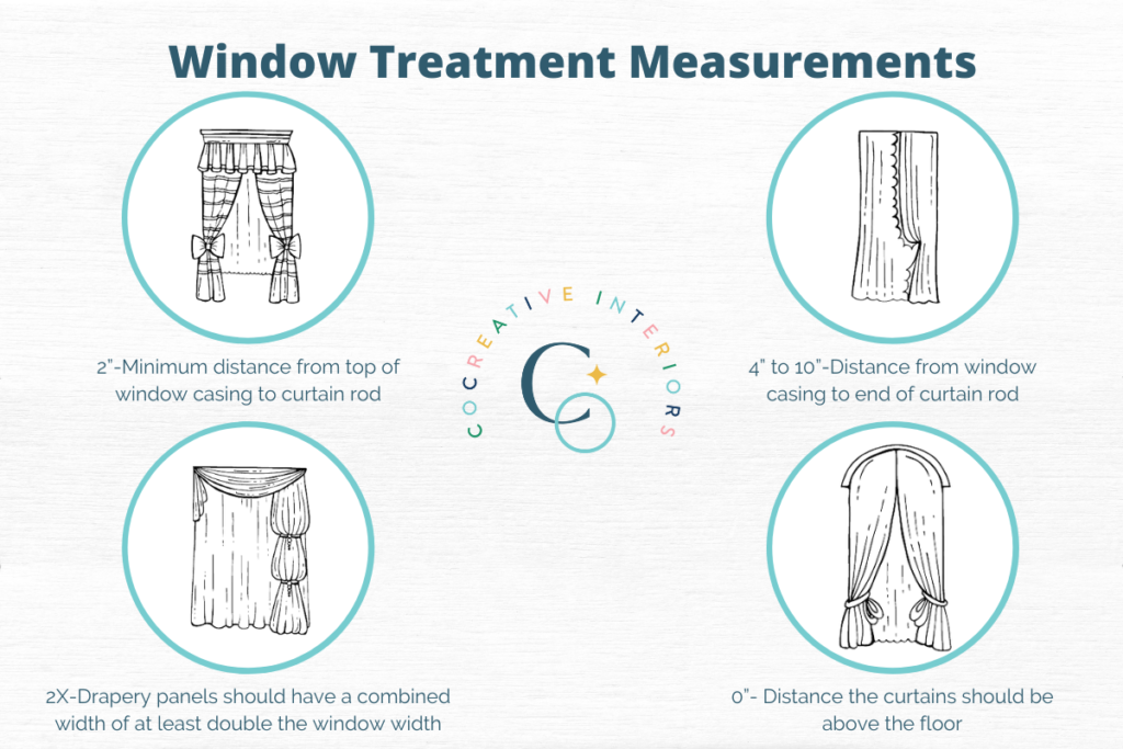
- 2″-Minimum distance from the top of window casing to the curtain rod. If you want to make the window feel taller, place the curtain rod closer to the ceiling.
- 4″ to 10″-Distance from window casing to end of the curtain rod (excluding finials) on each side of the window. If you want to make your window appear wider, have the curtain rod extend farther from the window casing.
- 2X-Your drapery panels should have a combined width of at least double the window width. When the drapes are closed, they should not be taut to cover the window.
- 0″- Distance the curtains should be above the floor. Curtains and drapes should always skim the floor. For a more elegant look, they can even puddle on the ground.
If your brain is swimming with all the measurements, don’t worry! While it can feel overwhelming at first, creating a plan is the easiest way to space your furniture in a pleasing and functional way. There are a variety of room planners available online, or get in touch with CoCreative Interiors! We specialize in helping our clients in the Charlotte, North Carolina area create beautiful, welcoming rooms that fit their needs perfectly! Book your complimentary consultation today!



0 Comments